Adding Distant Figures to Your Plein Air Paintings and Urban Sketches
by Anne Kupillas.
If you’re like most plein air artists, you’ve considered adding figures into your paintings. Adding distant figures can enhance your work in different ways, which I’ll explain below. When I first started painting outdoors, I focused on large shapes with landscapes and seascapes. If you’ve read some of the past blogs, you’ll know that it’s only fairly recently that I’ve added structures like buildings and other architecture into my paintings with confidence. Like most beginners, I have a fear of failure, or at least a fear or messing up a work that' I’m making good progress on.
So, like buildings, I tried adding figures into my sketches and paintings but failed in a variety of ways. I added them in too small or too large, misrepresented proportions, and made them too dark, the result looking like I “stuck” them on as an afterthought. I know many artists who are scared to add figures into their paintings, and so recently I’ve been showing other artists what I’ve learned by practicing this subject.
Just to be clear, I’m not talking about figure drawing or portraiture, only how to add small figures into your landscapes or cityscapes. In these situations, the figures aren’t meant to be the focal point of the painting, just additions to add to your composition and story.

Why add distant figures to your work?
By adding figures into your paintings & sketches, you can accomplish many things. Not only do you add the idea of life into a scene, but you can tell a story about the place, the activity happening, you can add movement, scale and mood. For example, a pastoral scene could just as easily be a forest, but adding figures means it will translate properly to your viewer as a public park. If you sketch purely for enjoyment, then it can help to accurately depict your recollection of a sketching excursion or vacation.


Here are a few tips to adding figures.
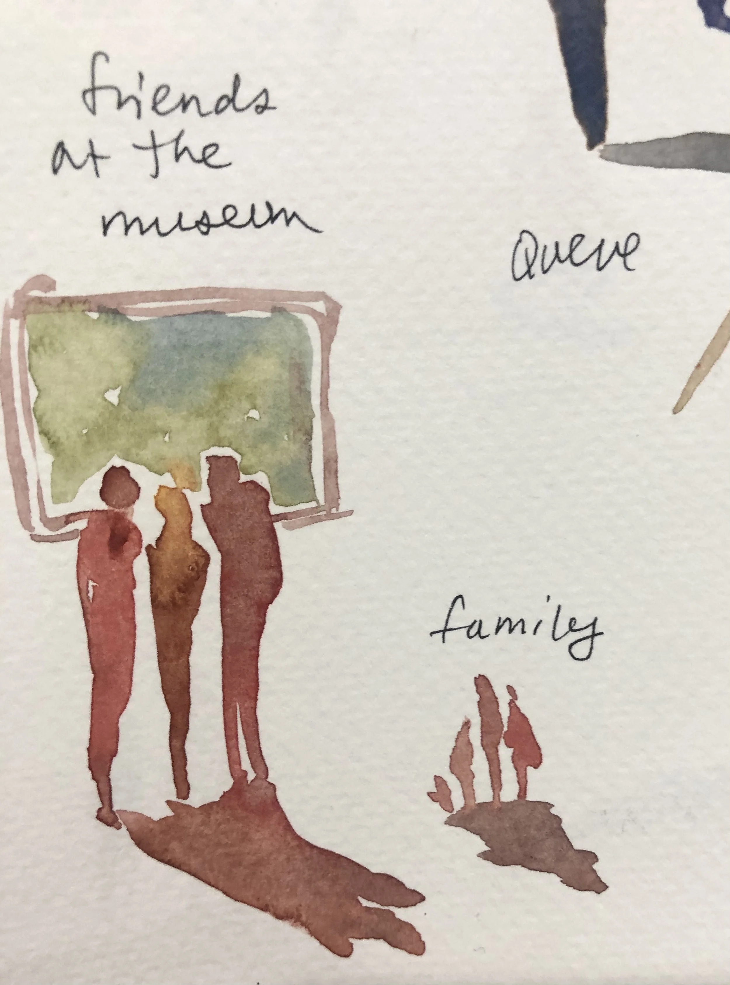
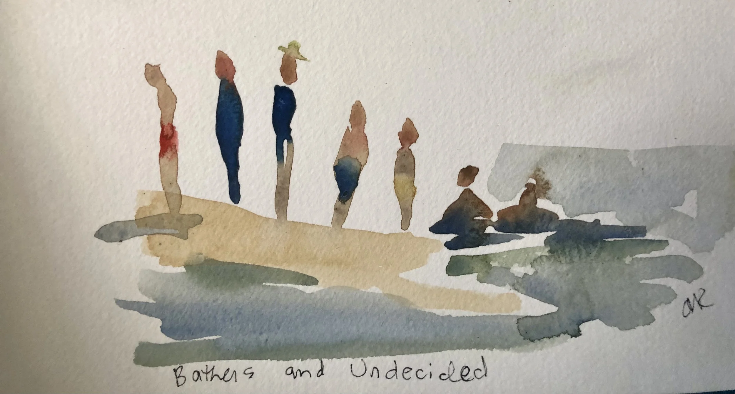
1. Don’t aim for portrait of a person– aim for a symbol of a person. I use three main symbols/shapes to make my representations: Carrots, diamonds, and perfume bottles. More about those three silhouettes below.
2. Less detail is better. Since you’re adding figures in the distance, the amount of detail should be small. As things recede, fewer details are observable to the naked eye. And again, the figures are only supportive and not the main players in your story, so they shouldn’t command too much attention.
3. Don’t worry about messing up! The human brain is clever. It will fill in the blanks and a “sort of” human shape will translate to a person in the distance. Trust me on this. None of my figures are perfect, either in proportion, anatomy or color. It doesn’t matter, as long as you get the shapes and proportions reasonably close to human.

Easy Shapes / Symbolic Representations for Figures
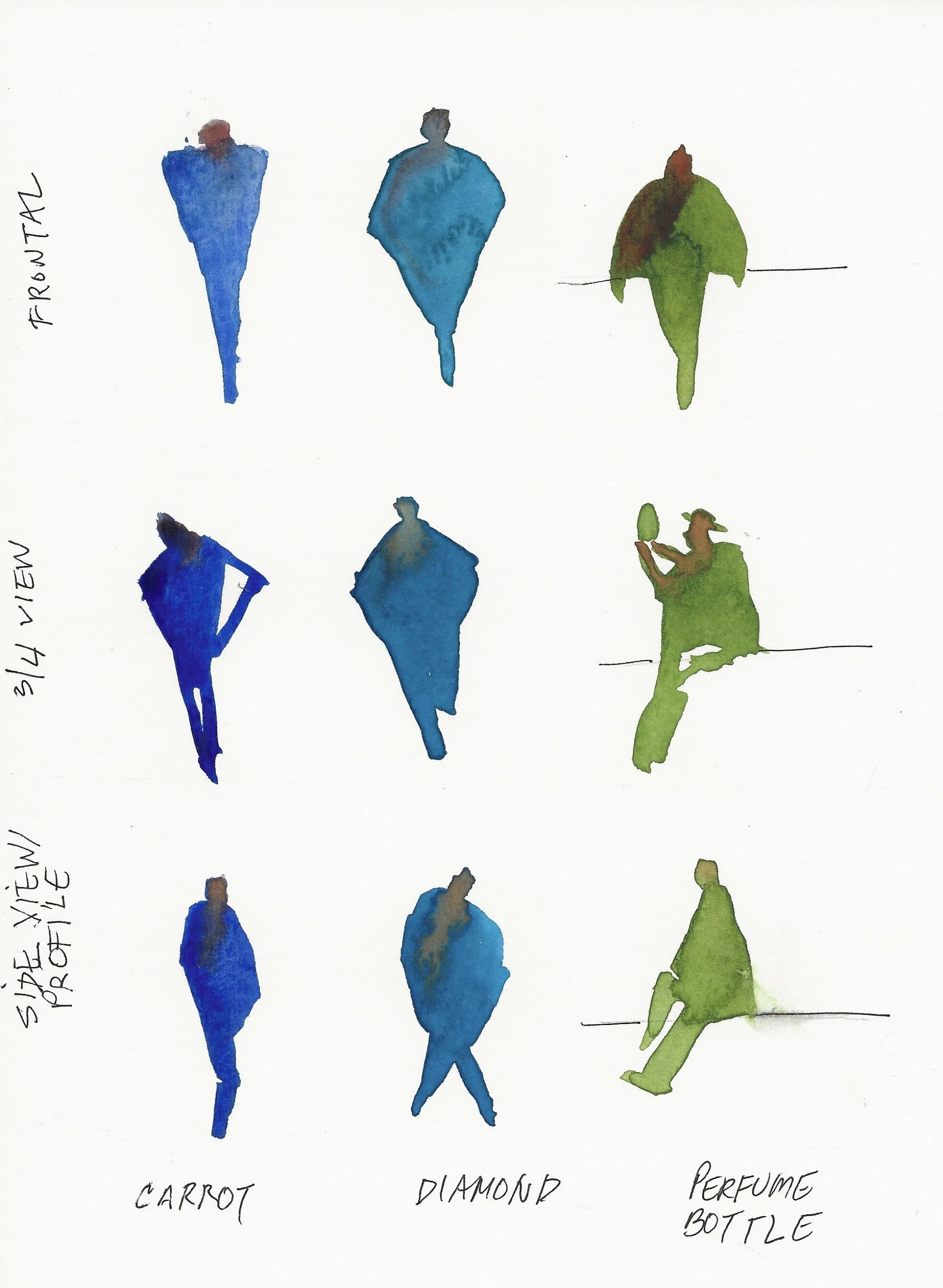
Carrot – this is the shape I use to create standing figures that are either standing still or walking towards or away from me. I can create a carrot figure in two strokes, using a paintbrush. I recommend starting with the shoulders. Note that shoulders slope or angle down, they don’t really curve when standing (reserve that shape for sitting; that’s the perfume bottle). Note the human proportions : adult males on average measure approximately 8 heads high, females 7-7.5 heads, and children are smaller (5 heads or less), with larger heads in relation to their bodies.
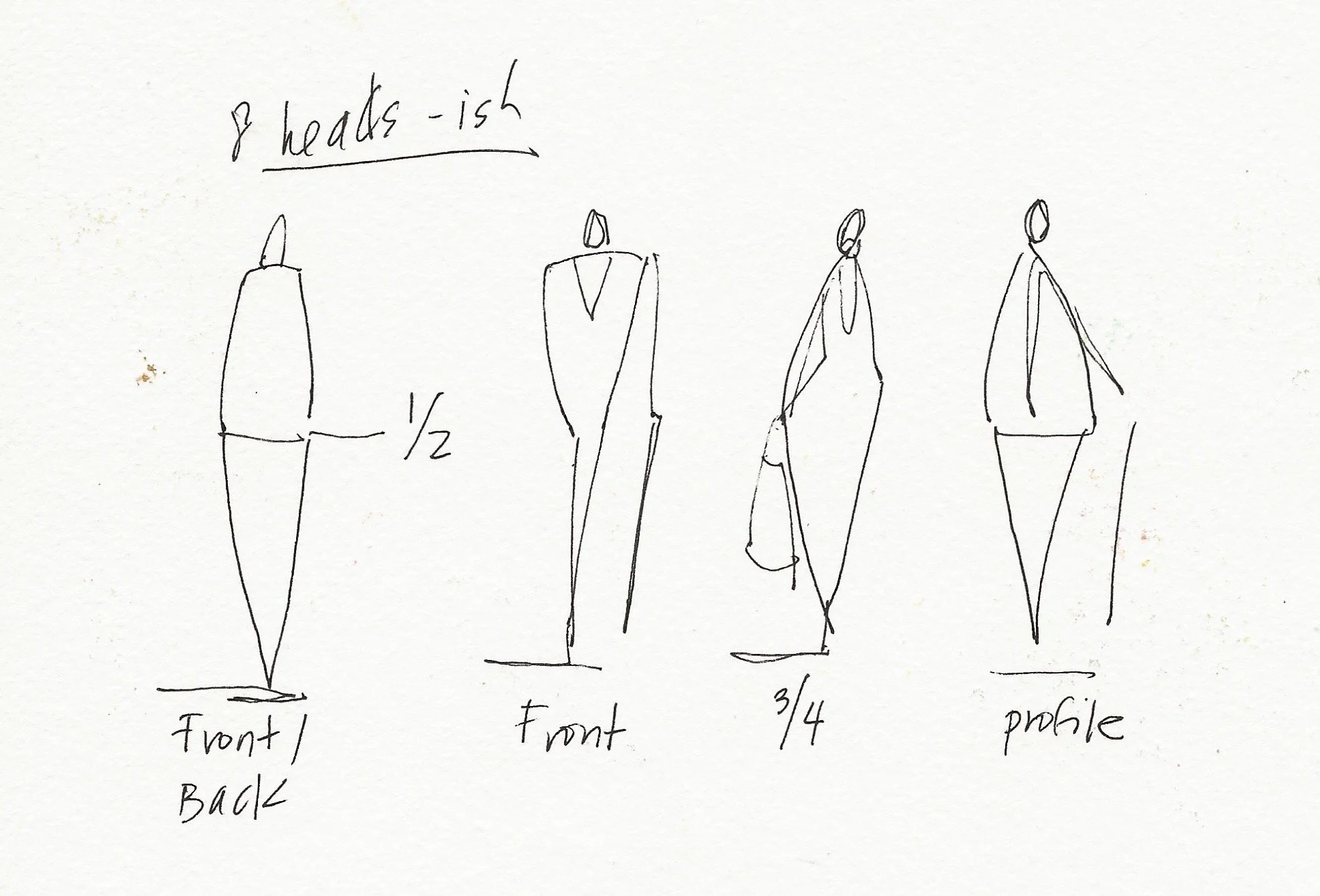
Once you’ve painted or drawn the shoulders, sketch slowly downwards into a tapered shape. Don’t add feet! They’re unnecessary distractions, unless you’re depicting dancers.
Add a small oval for the head and remember, you can always enlarge it, but making it smaller is much harder. Most beginners make the head much too big and the body too squat. I say, taper the body down and make it stylized – your stylized figures will look elegant and purposeful, rather than bulky and “off.”
The head should float or sit atop the shoulders. I rarely paint a neck. Most figures when walking will put their heads slightly down, especially when their hands are in their pockets, so you can add the head slightly inset at the shoulders.
Don’t worry about color, you can use all one color to practice, and add color later. Check out the full recorded workshop (it’s free) for tips on adding color into your figures.
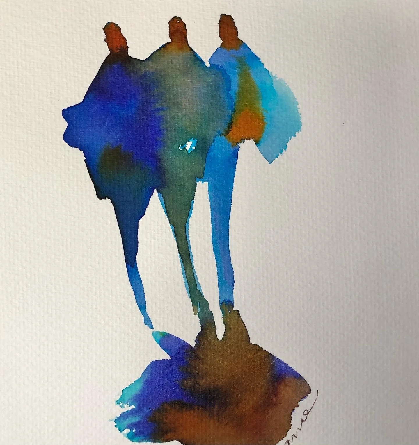
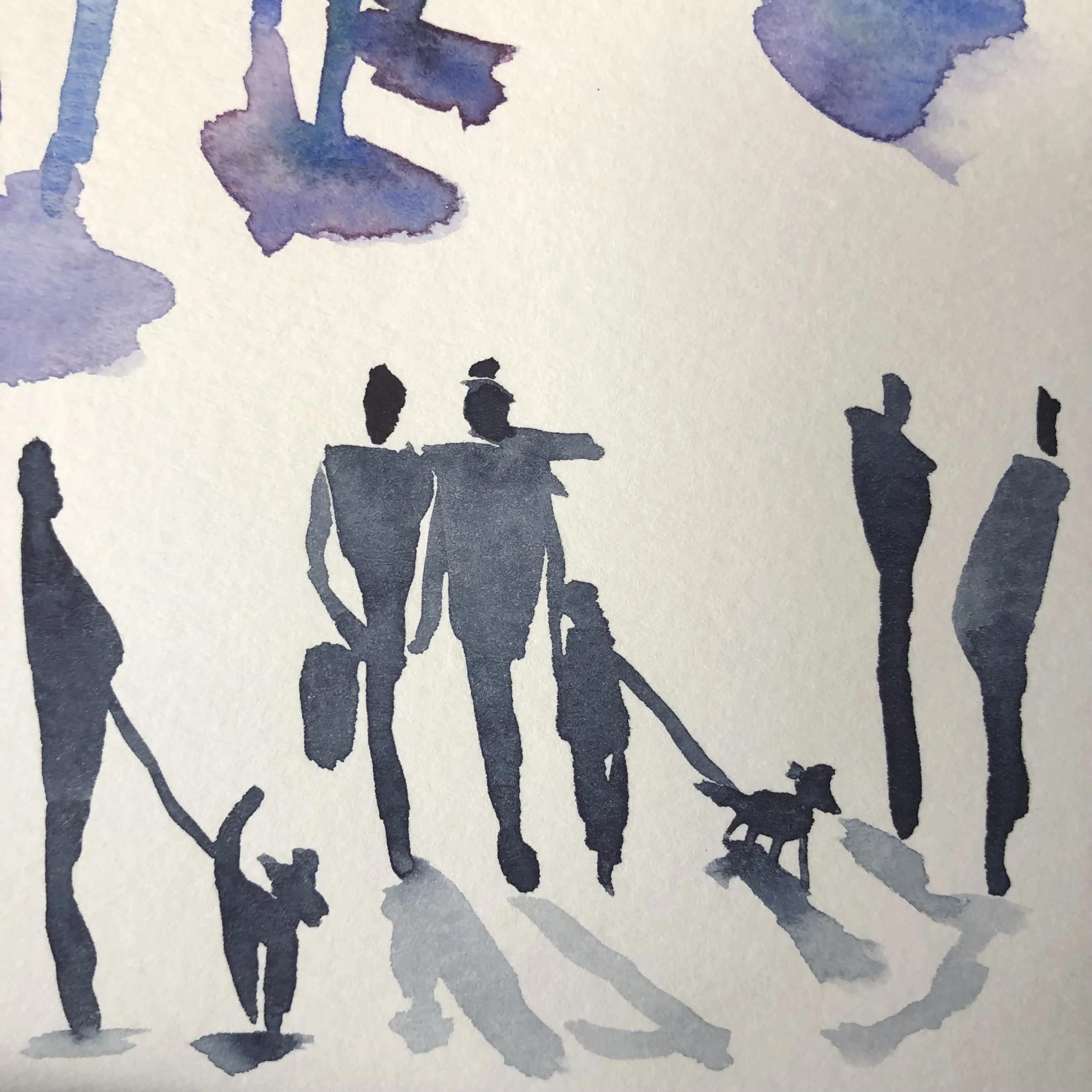
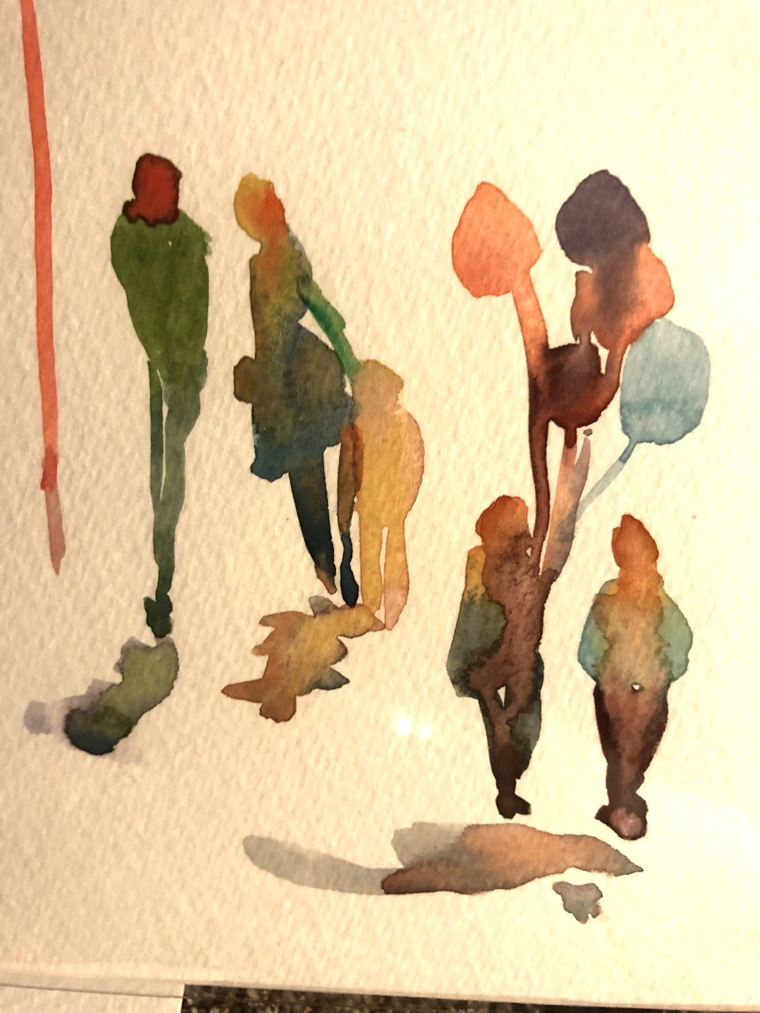
Diamond – this is the shape I use for bulkier figures – ie wearing more clothing, such as jackets in cooler climes – and for figures who have their hands in their jacket pockets. The method is the same, just angle out yoru carrot and fill it in a bit. You can even leave negative space at the “elbows,” like this:
Perfume Bottles– this is the shape I use for sitting figures. The shape “sits” on the line of whatever they’re sitting on – a wall, a bench etc – and I add the legs afterwards, below the line.

A few more tips:
1. People naturally face different directions. When standing, when walking, etc. Make sure to change the angle of the legs, the slopes of the shoulders, and color in the backs of heads darker. That way your figures will appear to be coming and going. Even if your figures are all facing a landmark, for example, alter their body positions, to be facing front, ¾ and profile. Let me tell you, if you forget to do this, you’ll end up with a zombie march painting.
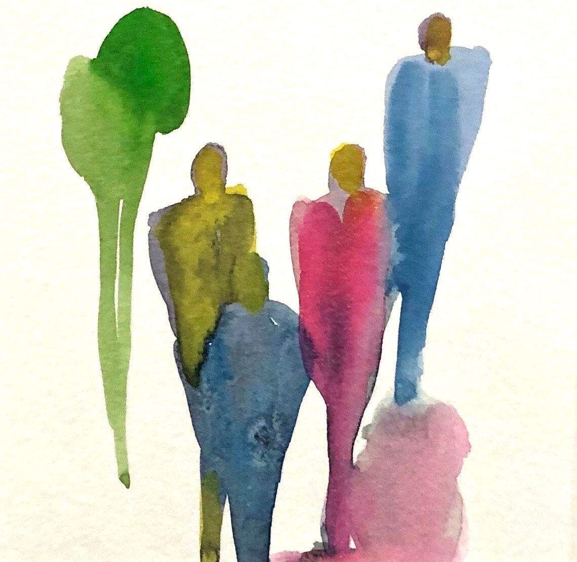
2. In the same vein, a single figure can indicate a mood – solitary, lonely. Groups look friendlier and indicate a more social atmosphere. Remember in your groups to include pairs and groups, not just lone figures. Groups can be painted with their bodies in one shape and then modified, and heads and legs after. I like to just “pull” the paint down into the legs, and dot the head in with the toe of my brush bristles.
3. Add a shadow to ground your figure. It can be very simple, just a brush mark. Otherwise, your figures will look like they’re floating. Note the position of the sun / light, and make sure your shadow directions are all relevant.
4. Remember the horizon. Heads of all your standing figures should naturally line up approximately at the horizon line, no matter where they are placed in your drawing (unless you’re sight line is from above the horizon).

Adding Color
Once you’ve gained confidence painting monotone figures in scale in these different shapes, you can start to add some color. I like to touch in or drop in color while the shapes are still damp, to suggest clothing and sometimes hair or skin. This allows the colors to blend and mingle and adds to the atmosphere – the color differences will suggest shading and features, but not distract with crisp detail. For figures in the far distance, I don’t even bother. I keep those figures all in one color. The closer figures (middle ground) can have a bit more differentiation.
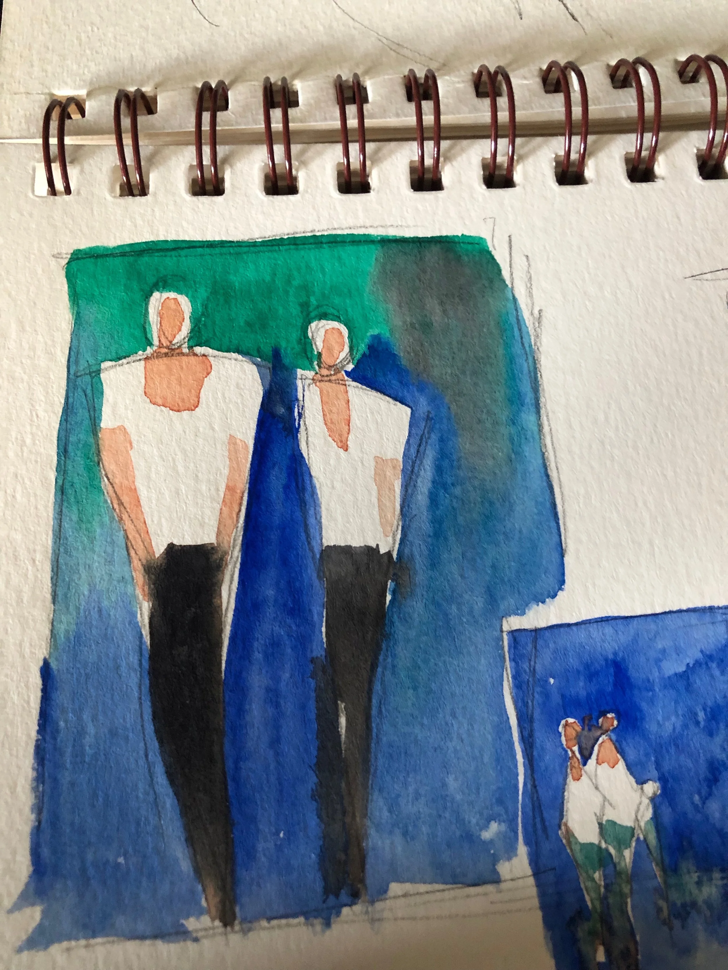
Many successful artists use a red or orange to drop in or paint the head. Heads and limbs, especially when backlit in bright sunlight, will appear reddish. So this is a good construct to adopt. In very bright sunlight, you can also leave white bits at the tops of arms and shoulders to add a little “sparkle” to the figures. Hazel Soan is a master at this technique.
For white clothing or lighter clothing on a dark background, I use a negative painting technique to paint around the figure. When the background is dry, I can add lighter colors, flesh tone etc. I hold my brush upside down to capture the head first (the only time I do heads first) then flip it back to normal to finish the figure.
People ask me how dark or thick their paint should be when adding figures. My answer is that depends – on the background and overall importance of figures in the sketch or painting. Just beware the overly thick mark, it can make your figures appear stuck on and the goal is mostly for them to blend.


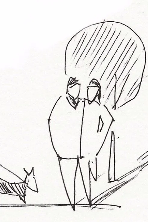
Another tip – other symbols can indicate life and scale in your painting. Practice painting lampposts, benches, signs, bicycles, dogs, etc. All these things can be abstracted and added to your works to show signs of civilization. Don’t overdo it, make sure they are adding to your work, not taking away or cluttering it up unnecessarily.

My biggest pro tip? PRACTICE. Go to the beach or park, or stand opposite a busy corner, and just practice shorthanding figures as shapes without worrying about backgrounds. Or call up some piazza images on the computer. With practice, you’ll gain confidence and I hope you’ll find that adding figures into your plein air work isn't nearly as intimidating as it seems.
Check out the full recorded workshop (it’s free!) for all my tips on adding figures and to paint or sketch along with us. Thanks for reading!


Eat Paint Live
If you’re interested in drawing and sketching on location, with a group of great artists, then I hope you’ll check out the art retreats we’ve planned, with Charlie and I as leaders at www.eatpaintlive.com We host same-day workshops and art retreats with small groups (no more than 9) in stunning locations. I invite you to join us in the Cotswolds (3 weeks from now!) or in Ojai in September.